Showing posts with label interior design. Show all posts

Christmas Comes and The Cats Carry On

by 6:07 PM

As Christmas approaches this year, I’m rather happy that I have managed to keep ahead of the holiday decorating. When the children were small, I usually started breaking out Christmas trees, lights, nutcrackers and all the other holiday gimcracks on the day after Thanksgiving, in the hope that I could get the balance of it done by the end of that weekend. As they have grown up (and one has left home) my efforts have gradually slipped into early-December; while there are some traditional decorations that must go up every year, there are always a few that have been forgotten or fallen out of favor.

The Nutcracker Army stands at attention. I think the cats find them intimidating.
One year, we had four full-size Christmas trees in the house—the primary tree in the bay window in the front room, the traditional “children's tree” (covered with Disney, Muppet, Looney Tunes etc.) in the family room, a basic "lights-and-balls” tree in the sun porch, and a large old tree passed down from my in-laws, which was erected in the basement one year and covered with tinsel, white lights and a host of those old-fashioned, blown-glass German-style bulbs. That was not long after we moved into the house; we had the basement partially fixed-up for kids to play in, and we invited all my aunts, uncles and cousins over. Note: My mother was from a family of twelve, and I have at least 64 first-cousins, so you may understand when I tell you we only did this once.

The foyer, with it's nutcrackers and much-abused floor.
Currently we had been hosting my three older brothers and their families for Christmas on a rotating basis every three years—now my nephews and nieces are beginning to join the entertaining queue, since it has become more of a challenge for my aging siblings and the younger generations are eager to pick up the slack. This is an “off” year for us, but we do plan on doing some entertaining over the holidays, and our daughter will also be coming home from Manhattan Christmas week.


The Captain of the Guard needs a candy dish.
As I write this, I have the main tree in the front room finished and most all the interior decorations are out, including the small army of nutcrackers that inhabit the foyer every December. Last on the list is the “children's tree” which we will finish up by this weekend. The exterior of the house is ready too; since we have lived in two-story homes, I always avoided string-lights and gone with colored outdoor flood lights, which my father always seemed to prefer, too. My wife always chides me that I am taking the easy way out, but I find the end result rather pleasing. We also add some red candle-lights in the upstairs windows along with wreaths and faux pine garland on the front door, coach lights and fences on either side of the house, to finish things off. Some past years I had tossed in some string lights in the shrubs out front, or on the small dogwood outside our front door, but I lacked the motivation to undertake this chore in 2017.

Thankfully, our cats have not seriously disrupted our holiday decorating schemes. Our black cat has occasionally managed to insert herself into the family room tree and stretch out across some of the lower interior branches, where her yellow eyes can sometimes be seen glaring at us from deep within. The tree is, however, quite sturdy, and up till now this has not been an issue; but as she continues to grow older and fatter, I resolve to take more notice.

The tree in the front window. Safe for now.
The very young cat that I rescued from the arborvitae in the backyard around Labor Day has been thoroughly assimilated into our household, and while she initially took great interest in knocking off some small bells and a couple of ornaments from the tree in the front room (and thoroughly disheveling the tree skirt) her interest has lagged somewhat over the last week, and I have been happy to find no new shiny things on the carpet or under the coffee table.

One issue that I did note was the condition of the oak floor in the foyer, which usually gets some tending to prior to the deployment of the Nutcracker Army. Last year, the floor got a solid going-over, as our old tomcat, Percy, had inflicted numerous small scratches at the foot of the stairs, where he scrambles to make the turn and head up to the second floor. Some cleaning, touch-up with a color-matched marker and a coat of sealant had it looking almost as good as new.

You may ask why we do not just have him de-clawed; he went to the veterinarian about a year ago since it was clear he was not feeling well. We asked to have him de-clawed, whereupon they told my wife that would be too stressful for him. As an alternative, they removed all of his teeth, which I imagined would be a great deal more stressful, but they insisted his dental work was in poor shape and causing him significant discomfort. Who was I to question?

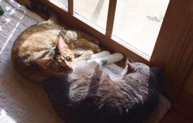
Percy and his adopted little sister, Itty Bitty, behaving themselves.
Which brings me back to the floor—sorry for the digression—which has come under further attack now that the young cat and Percy regularly chase each other up and down the stairs. I was aghast as I held my face above the floor with marker in hand, trying to hide the scratches and gouges they had inflicted upon it. About a half-hour later, I was satisfied, and the wood looked much better. For now, there is little trace of the cats’ mischief, other than when I walk into the foyer and see the carpet runners skewed at various angles or pushed up against the wall.
What the foyer looks like when the cats are not behaving themselves.

Over the coming days, perhaps I will post a few of those beauty vignettes that I see on so many home and design blogs. Then again, I may doze off in a fat chair, with a book on my lap and a glass of ale by my side, and forget to do so. We shall see.

Basement Renovation: Part 2: A Modest Wine Cellar

by 7:13 PM
Let me first come clean and explain that I am not really a wine enthusiast. I do drink and enjoy it at times; usually at a meal, when paired with the right food. When my wife and I travelled to Napa a couple of years ago, I loved the wineries. I loved sampling the wines—especially when they served them with some really tasty chocolates.

Nevertheless, when it comes right down to it, I am a Beer Guy. Not the vapid swill that passed for beer during most of the last 50 years, but better quality craft beer and exports.

Finding this door for $50 was one of the best
things about this project.
My wife likes wine, but generally she prefers very sweet wines—Muscato, Prosecco, ice wines or an occasional Reisling. For the most part, these are not the kind of wines that hang around very long—or that improve significantly with aging.

So, why a wine cellar, you may ask?

Well, for one thing, we have friends who like to drink wine, maybe before, during or after dinner. So it’s always a good idea to have some on hand.

In addition, I planned to store some craft beers in the cellar as well—in particular, those high-gravity stouts, porters, ales and barley wines that do age and mellow well.


I also wanted a place to store and display related items, like glassware, books on wine and beer, and related memorabilia, in addition to some of my home brewing equipment.

Last of all, I think the house deserved a wine cellar. And why not? I had a perfect space under the stairs, and I thought if done reasonable well, it would be a nice feature in terms of future resale. So there’s the logic.

THE PROCESS

First I had to enclose the area under the basement stairs with a stud wall, which was pretty straightforward. The main consideration here was the position of the doorway, ensuring plenty of full height opening clearance on the right side while leaving enough room to squeeze in some built-in bottle/book/glassware shelves on the left. Inside, on the right (underneath the descending stairway) I’d have room for an old wooden cabinet that fit nicely into the space, leaving some room for hidden storage behind. The whole space used for the wine cellar was about 3.5 ft deep and about 7.25 feet wide.

Clearly we require more wine. All good things in time.
The stud wall went up without too much trouble; the best thing I did here was finally invest in a nail gun, which made things so much faster and easier. I must admit my drywall skills leave something to be desired—the main problem being that I didn’t use enough mud at first, and then spread it out with a blade that was not really wide enough. This makes it necessary to go over the joints more than is necessary, and sand more than usual. I suppose the results show a little here and there. Next time, I resolve to get the proper tools and perhaps do a skim coat over the whole surface.

Once this part was complete, I set to do some carpentry. Most of the large 22oz beer bottles would store on wooden shelves I was building in—since beer is supposed to store vertically, unlike wine. For reasons I already mentioned, I didn’t require a lot of wine storage, but I did go the dramatic route and build a 6 foot tall vertical display that holds about 12 bottles horizontally against the wall—so you can see the labels. As a supplement to this, I have a small wine rack on top of the cabinet that holds an additional 3 or 4 bottles.

The surfaces of the tiny room feature various materials which all seem to go together. The wood shelves and trim inside are mostly mahogany-stained pine. There is some cork on the back wall between the upper and lower shelves on the left, and about 18” of the back wall (originally sheathed with paneling) is now covered in some 30-year-old wallpaper that I saved from the time I worked at Wallpapers-to-Go. It was a heavy, saddle brown paper with nice images of vintage French wine labels; I knew I’d eventually find a spot for it…and I did.

Most of the remaining back wall is solid concrete in a rough molded brick pattern; this was painted a dark tan. One advantage this offers is that the concrete remains cool at all times, and with the wine being stored on this wall, it remains at a fairly even temperature. I also used a bit of the wine wallpaper underneath the stairs on the right, trimmed out in some mahogany-stained pine. At about the 5.5-foot level, I hung a roll-up blind down from the bottom of a riser, so it extends to the floor. This serves as somewhat of a “false wall” behind my storage cabinet, which is about 30’ high, and I use the 2’ of useable space behind the blind to store (and hide) large seasonal items, like a couple of  Christmas tree boxes.

The shelves provide lots of room for wine & beer books, and
bottled beer storage.
I managed to get a open box of premium vinyl wood planks at the Habitat store for about $10—just enough to cover the 18 square feet or so I needed in a nice dark brown. I haven’t decided what to do for the ceiling yet, but I’m thinking some wood, maybe pallet boards.

Of course, all this effort goes for naught if it’s hidden behind a door, and I hit the jackpot at the Habitat store once again, nabbing a beautiful wooden 30" French door for just $50. It was already painted white (and really didn’t need re-painting) and best of all, it even had beveled panes of glass!

I have tested some temporary lighting, and it’s clear that some nice wall spots inside the little room would make for a very dramatic look, so I’m thinking a couple of small units on the ceiling.

We completed the look with a couple of framed prints I made—they are some of the places we really enjoyed during our visit to the Napa Valley. I’ve added a couple of other chotchkes, like an ancient beer bottle capper, but am still looking for just the right thermometer to hang in here somewhere…


A Refreshing Houzz Take on Tudor Revival Interiors

by 6:30 PM
A Tudor Revival interior that embraces its unique details and original
woodwork. Courtesy Stonewood, LLC
I was heartened to see a story on Houzz the other day regarding the continued popularity of the Tudor Revival style in American homes, including an outline of its basic visual elements. Architect Steven Randal does a fine job of distilling the style's most essential design cues, and best of all, the story includes some excellent photographic examples of contemporary Tudor Revival interiors. The collection of images included with the article fully dispels the notion that these rooms are dark and dusty museum set-pieces.

Another room that blends with contemporary style.
Courtesy Margot Hartford Photography
The story was refreshing for another reason (one which I have noted more than once) regarding the “typical” rooms one sees when visiting Houzz. More and more, it seems that almost every room featured on the website is bathed in white; white woodwork, white cabinets, white floors, white furniture…all combined with a very trendy, “hip” design aesthetic that looks like it was inspired by any one of a hundred DIY-design-craft -blogs. I’ve found this to become fairly tiresome, and it’s only remedied by entering a more specific site search for rooms offering more traditional styles, more color, or more of anything not defined by “trendy.”

As I noted, the photos accompanying this story are helpful, in that they offer a clean and contemporary look that embraces each home’s Tudor details instead of painting them out (in white) or de-emphasizing them. This is not always an easy problem to solve, as we will eventually be looking to update the interiors of our own house, and need all the inspiration we can find.

You can reference the full article HERE.


Not a Change in Direction. An Expansion of Subject.

by 8:22 PM
When I first created this website, I wanted to have someplace where I could talk about the kinds of houses and buildings I loved, remember the people who designed and built them, recognize people who maintain, live in and restore them, and survey related topics in design, the arts, lifestyle and popular culture—including books.

Having utilized much of this accumulated information in the design of my own home—I have chosen from time to time to write about some of the projects I’ve worked on since building our house almost 25 years ago.  Some of the posts have involved thoughts on decoration, some are how-to’s (or maybe how-I’s) - that discuss things I’ve had to fix; other posts have simply touched on my own thoughts about building and design.

This is a bar-height island I am building in the basement using 2" x 4" framing and some used bi-fold doors. More on this project later...
As I’ve mentioned before, while I had very specific ideas about the design of my own house, budgetary issues (I was 34 when we built, and modestly employed) forced a number of compromises, some of which I have been able to remedy over the years. Many still remain, and I will increasingly use the website to discuss how they are being addressed, for after all—when is a house ever truly finished? When we built, I knew I would have to plan for the long term, assuming that some materials, designs and finishes would make an appearance at a later date. Sometimes much later, as it turns out.

I am a notorious procrastinator, so the fault is mostly mine. After some deliberation, I find myself in a good position now to make it down the home stretch and finally get things as I originally envisioned them years ago, when I set plans to sheets of vellum (yes, no 3D renders for me) and started searching for a general contractor.

So, interspersed among the posts on historical houses, old architecture books, preservation/heritage issues and related commentary—you can expect to see more “hands-on” bits and pieces about things I am doing inside the house.

I’d be remiss if I didn’t admit that I have clearly noticed the popularity of so many design and “how-to” blogs; so I feel it is a natural course to develop this approach as I go along. It’s a chance to further explain—in practical terms—how I try to integrate whatever knowledge I have accumulated and my own design sensibilities into the projects I take on inside these four walls.

If, Dear Reader, you care to comment, share your thoughts or experiences, or ask questions, I will sincerely appreciate it, and would love to hear from you.

A Tale of Two Tudors

by 6:02 PM
When talking or writing about Tudor Revival homes here in The States, it’s clear that in terms of quality, they clearly run the gamut—from beautiful and authentic-looking examples like Akron’s Stan Hywet Hall, to decent-looking suburban homes, to less-convincing modern interpretations—and then to what can only be considered abominations, like a Tudor ranch or split-level. Whatever type you might happen to encounter, it’s best to always be ready for a surprise.
Sometimes it's all in the details...
So it was on a recent winter Sunday. There being no football (it was the week before the Super Bowl) the wife asked if I would go with her to look at some very large “open houses” for sale on the other side of town. Once in a great while, we do this for pure entertainment—or what I like to call “shits & giggles”—to see what is out there on the market and perhaps collect ideas for our own home.

All of the homes we visited were significantly larger than our present home, and about three times as costly. None were really practical for us, since investing in a far larger house at a time when most couples are getting ready to downsize for retirement doesn’t make sense. Nevertheless, we got in the car and headed out.

Only two of the homes we visited were really worthy of note; both were Tudor Revivals, and both had both good and not-so-good elements that caught my eye. They were built almost 20 years apart (1971 and 1988) and both had some interesting stories to tell.

Not a bad looking house at all - considering it's a relatively recent effort.
Almost there
.
The first of these houses I remembered quite well, having seen it well before I built my own house in 1992. The exterior is in excellent shape after almost 30 years, and I must say that in terms of overall design and massing, it is one of the better Tudor Revival-style homes I have seen built in recent times. The roof pitches are fine, the half-timbering work is reasonably robust—not thin and chintzy like so many other recent examples—the plan is angled and irregular, and the stone and brickwork is competently done. Parts of the second floor are even jettied-out over the ground floor, which is also nice to see.

It is not perfect. The house could stand some more detail in the timberwork. The windows are a little too tall, and feature a combination of both square and the cliché diamond-pattern grilles that are always too large and out of scale. Worst of all, they are all white, when they should be the same dark brown as the timber. The overhanging jetties also lack any corbels at the ends or other supporting structure, which gives them a stark and unfinished character.

Overall, the exterior provides an example of a fine, custom-built house (I would assume the work of an architect) that could have greatly benefitted from a little more care and research. I think a lot of American designers use houses built in the 1920’s and 30’s as traditional design guides, instead of resourcing original English examples or even old pattern and style books, like Garner & Stratton’s Domestic Architecture of England during the Tudor Period. The result is often a loss of detail and in less adept hands, some clumsy or incomplete results. The good thing about the exterior of this home is that it could be easily remedied with a few additional elements.

The door is nice. Not a fan of the parquet. The stair rail belongs in a
colonial house
.
As solid as the exterior was, the interior featured little if any historic detail. There was plenty of brown oak, yes, and a nice arched front door—but inside I found the traditional-style woodwork you’d see in any nice home; a spindly staircase with thin balusters and a curled volute newel detail at the bottom and the ubiquitous six-panel colonial doors. Where one might have employed a Tudor arch, or even a curved arch over a wide doorway, the builder had substituted rather crude-looking openings with the upper corners cut and cased at a 45-degree angle. The home’s fireplaces were either stone or brick, but were utterly plain and ordinary, and could have been found in almost any home. There were some nice built-ins and storage, but nothing extraordinary, though the master bath did have some very fine English-style cabinetry. One interesting feature was the slim doorway/balcony in the master bedroom that overlooked the two-story great room—a historical nod to the “squint” or “chaperone” window found in many ancient Tudor homes.

The way the cased opening here is handled leaves a lot to be desired.
All in all, for about $650k it was still a very nice house on a large and attractive treed lot, but one that deserved a little more attention in terms of detail. I was thinking another $50k of proper detailing and upgrades could bring it into line.

I found the other Tudor Revival home on our tour to be a great curiosity. My first impression was that someone had taken a rather straightforward two-story colonial home and tacked a brick Tudor-style entry porch onto the façade. I see this feature on a fair amount of Tudor Revival houses, both new and old—when the entry roof pitch is too steep, it borders on the cartoonish. This one was a pretty close call. The front was extended a little to the right, ending in a long side-entry garage featuring a second story with shed dormers. The windows were too large for the style. From the street, it did not appear to be such a happy composition.

One of the only houses I've seen that looks better up close than at a distance.
Going up the driveway and standing up close, however, I found the overall effect to be far more pleasing. Closer inspection revealed that the ground floor was clad in fine, old-style brick all around—the same as on the high-peaked entry front. The upper story was covered in rough clapboards, but the edges were cut in a wavy, irregular style and finished in a very dark, almost black stain. The stonework around the entrance was very fine as well, and the doorway was flanked by some very large, black iron torchieres that looked like they were a hundred years old. Clearly, whoever selected the materials knew what they were doing, because the resulting combination of colors and textures felt very natural and appropriate.

Remember, this was a 1970’s house. I didn’t expect much from the interior other than harvest gold Formica and tired, avocado carpet. I was right on that count, and the furniture still in the house was from the same era. It was almost like a time machine.


The plaster fireplace surround and crown molding was superb - and
terrifically Tudor!
But here again, there were many surprises. There were beautiful, authentic plaster details found throughout the house, and best of all, they were actual Tudor designs, including a splendid mantel, excellent cornice and crown moldings, ceiling medallions—each one looked like it had been picked out of a 1920’s catalogue. The doors were solid wood, and were of the appropriate 8-panel Tudor-style. Some of the rooms featured coffered ceilings or peaked ceilings with beams, and a couple of the bedrooms combined that with walls paneled in wide, hardwood boards. I had mixed feelings about the foyer stairway, it was broad and curving—and open to the basement level as well as above. Rather than wood, the stair had a curved iron railing, which would probably look much better if refinished in black rather than its current funky 70’s gold. Removing the carpet on the stairs would help too, I am sure. Then again—there was carpet just about everywhere; being a 70’s house, I wondered if there was hardwood underneath any of it.

Peaked ceiling...and paneled with real hardwood boards...not the
cheap stuff you'd expect.
The kitchen and bathrooms all needed to be re-done. The fixtures and cabinetry, while clean and in very good shape, were old and outdated. The house even had an elevator, and the Realtor whispered to us that there was a secret staircase that went from the owner’s suit up to the attic and down to the basement. A secret staircase! How Totally Tudor of them.

Exterior aside, I left that house being quite impressed by the attention to detail and high standards of the original builder and owner. Though the exterior elevation left something to be desired, some of the interior details were totally unexpected. I can’t imagine many of the architectural products were commonly available when the house was built—as Tudor homes were seriously out of style in 1970. They must not have been that easy to source. Even today, with the help of the internet and its worldwide reach, it’s not always so easy, as I have noted previously.

Now if you combined the exterior design of the first house with the attention to detail of the second house, you'd really have something.

As I said, always prepare to be surprised.


Basement Renovation: Part I

by 8:10 PM
The following story is somewhat of a “catch up”—since the process of improving and finishing our basement has involved years of procrastination, interspersed with periods of creativity, hard work, rudimentary planning, adaptive reuse and carpentry. Here goes…

I suppose I am not alone in saying that the state of our basement (or cellar, if you prefer) has always been a sore spot in our household. It seems this is the case for many homeowners.

When we built the house almost 25 years ago, the basement served only as storage for a growing accumulation of little-used “stuff” and a place to do laundry. The best thing about it was that due to the poured concrete walls and our well-drained lot, it was always dry as a bone.

About 15 years ago, I embarked on a project that divided the open space into a couple of workable areas devoted to specific tasks. First of these was a workshop for myself, which included the mechanical systems like the furnace and water heater, followed by another area that was used for storage and laundry. The storage and laundry areas were enclosed by simple stud-framed walls. The workshop was a slightly different matter—the “wall” separating it from the rest of the basement was simply formed from 3 large matching bookcases and a desk/bookcase unit, all connected together, then with the 2-foot gap between the top of the cases and the floor joists above filled in with 2’’ x 4’’ framing. A 32” gap between the bookcases became a convenient doorway, and the upper stud-framed portions sections above the bookcases were covered in paneling. The result looks like a wall of built-in units, which they truly are—and since they are not load bearing, they fit their purpose just fine.

The storage room I had created included a half-dozen large steel shelving units, which were filled rather quickly. After a few years, it became clear that more storage was needed for the overflow, so I built in some closets toward the front of the house, near the foot of the stairs. This area was relatively convenient to the kitchen, and would offer a fine place for my wife to store some of her larger serving items like large chafing dishes and pans, food warmers and seasonal serving and entertaining accessories that she uses just a few times a year.

Originally, I had intended this closet wall—which was about 10’ across—to include a central 4’ wide, 2’ deep inset where I had planned to place yet another one of my many bookshelves. This would have been flanked by a storage closet on each side. Unfortunately, once I had already framed the wall for this, The Boss said she preferred a whole wall of closet storage, and the inset was walled across and another door added. The end result looks fine but the change in plans on-the-fly resulted in a wall of three 24” bi-fold doors where two 36” bi-fold doors would have saved installation time and been slightly more practical. Henceforth, I resolved to consult The Boss prior to framing.

That covers most of the preliminaries up to the present time, with the exception of the wine cellar built under the stairs. That feature deserves a post of its own, and that’s where we will continue this saga…

The Challenge of Sourcing Appropriate Period Items

by 6:00 PM
Decorative plaque - provided by TudorArtisans.com - USA
If you are interested in architectural and interior design of the Tudor and Elizabethan periods, or you’re looking to restore a home built in a revival of these styles, one of the primary challenges is to find appropriate materials here in the States. Eighty years ago, it was easy to source such items as plaster cornice and mouldings, fireplaces, brackets, corbels, light fixtures, hardware and furniture that would look right in a Tudor-revival home. Today, there is little available. Other than the handful of legacy remnants available from old line US suppliers like Decorators Supply or Fischer & Jirousch, almost no one makes them anymore, aside from high end custom crafters and cabinetmakers.

Today, most suppliers offer a range of classically-inspired products that would fit well into a colonial or Georgian home, but provide almost nothing that is suitable to an earlier time period. Whether it’s a chair rail moulding, a wooden mantel, or even a wooden interior door—the choices are generally limited to very common traditional designs. Think of egg-and-dart, dentil mouldings, colonial casings or the ubiquitous colonial six-panel door and you know what I mean.

Even in my own house, built in 1992, I was limited to these sort of items in terms of availability and budget. I did demand a rather chunky staircase balustrade and had a very large, custom newel post built—I also had a custom mantelpiece made for the family room that was essentially Arts & Crafts in design. Any other resulting detail items I could manage were best described as Victorian (small carved wooden brackets in the dining/living room openings, and faux-plaster ceiling medallions over the kitchen and dining room lights. My doors were six-panel colonial, since the only other affordable and easily-obtainable alternative was a plain surface hollow-core slab door.


Staircase - courtesy Distinctive Country Furniture LTD - UK
As it turned out, the result was ok; many of these items might have been found in similar combination in an “Old English” house of an earlier time—particularly here in America, where styles were often blended together. As time goes on and I embark on future projects, I may remedy this situation to some extent, as far as time and budget allow.

If one has the means to import items from the UK, the issue is not quite as severe. A better selection is available, not to mention salvage items available from both online and brick-and-mortar vendors. In addition, my Twitter feed is full of highly skilled craftsmen who work in stone, plaster, glass, iron and wood, and almost any of them can create something both appropriate and beautiful—for a commensurate price. Sadly, the exchange rate and shipping across the Atlantic remain serious considerations, but for many, this remains a worthy option.

For those who are fearless, and who possess some level of skill and imagination, the remaining alternative is to make these items yourself. If one is able to obtain at least one appropriate decorative item, it is not so hard to make a mold and cast (in plaster or resin) the additional number required. Originals can be shaped in clay, or carved from wood, if one has the patience and requisite skill. Even if one lacks the ability to do hand-work, modern technology makes it possible to model a decorative piece using 3-dimensional software and send a file to a woodshop with a CNC router that can carve the item from a block of wood in a matter of minutes. Not inexpensive, but often less costly than paying a craftsman to make it by hand.

Lovely medieval floor chest - courtesy Early Oak Reproductions - UK
Perhaps the best solution is to use a combination of all these methods when it comes to sourcing decorative items for your period home. Where common or traditional materials can be made to “fit the bill”—feel free to use them and flip the resulting savings into cash that can be used to purchase those few specialty “feature” items that will set your project apart.

Likewise, do not be afraid to try your hand at creating a decorative detail yourself. If it doesn’t turn out quite as perfect as you would have liked, you don’t have to use it in your entrance foyer; integrate it into a bedroom, a back hall, or even a basement rec room—places where any shortcomings will be slightly less visible.

Stone carved head - courtesy Nick Roberson - UK
I would also suggest that at some point you spend the money and have a craftsman build or create some feature item that you can integrate into your interior or exterior design. It may only be a single door, a carving for a fireplace, a plaster panel or a bit of iron hardware, but it will add both value and pride to your finished project. In this age of technology, traditional crafts cannot be allowed to disappear, and it is important that we support them so they will be available to future generations. Today’s best craftsmen work hard to learn their trade and spend many hours researching proper design and technique—whether it involves carving stone, building furniture or modelling in plaster. The results of this speak for themselves. Make use of them if you can.


Duretta and O'Kast: The Look of Wood for Less

by 5:00 PM
I have long been fascinated by old building technologies; in particular, some of the materials and designed that were developed during the early 20th century. A few months ago, I discussed magnesite stucco, and this time we’ll take a look at a synthetic stand-in for traditional carved woodwork known as Duretta.

Aside from design, one of the foremost properties considered by architects and builders was the ability to be fireproof. This is precisely why stucco, concrete and brick were so popular, and why asbestos was so common in stucco mix, shingles, siding, flooring and other items used in construction.

The New York firm of G.E. Walter developed Duretta for use as a cast material, used to replicate carved wood and metal. It was used for carved wood paneling and wainscoting, door panels, wall friezes, grilles, fireplaces, rails and even exterior half-timber work. Company literature only describes it as a “plastic, fibrous, composition material” – though its exact formula is not known, the fact that it was clearly described as being fireproof would lead one to think that asbestos and perhaps some gypsum may have made up at least part of the mix.

Finishes for Duretta varied; most items were finished to look like wood, and the company claimed that when so finished, it was practically indistinguishable from the real think. Other pieces were finished to look like hammered metal, and still others were provided a special, more durable finish for exterior work.


G.E. Walter was not the only manufacturer to follow this route – other companies like Cleveland’s Fischer & Jirousch (still in business) also developed similar products, like O’Kast (“oak cast”) which also mimicked the look of carved wood. Some of these old wood panel designs are still available, though I do not believe the O’Kast material is still being used in production.

It is amazing to think that there were once a large number of firms designing and producing cast interior and exterior ornament for buildings in the United States. Today there are only a handful, and most of the currently-available designs are based on classical themes rather than the medieval and tudor styles that were so popular during the late 19th and early 20th centuries. One wonders what happened to some of the old proprietary formulas used for these products, as well as the fate of the molds that were used in their manufacture.

Duretta and O'Kast: The Look of Wood for Less

by 5:00 PM

I have long been fascinated by old building technologies; in particular, some of the materials and designed that were developed during the early 20th century. A few months ago, I discussed magnesite stucco, and this time we’ll take a look at a synthetic stand-in for traditional carved woodwork known as Duretta.

Aside from design, one of the foremost properties considered by architects and builders was the ability to be fireproof. This is precisely why stucco, concrete and brick were so popular, and why asbestos was so common in stucco mix, shingles, siding, flooring and other items used in construction.

The New York firm of G.E. Walter developed Duretta for use as a cast material, used to replicate carved wood and metal. It was used for carved wood paneling and wainscoting, door panels, wall friezes, grilles, fireplaces, rails and even exterior half-timber work. Company literature only describes it as a “plastic, fibrous, composition material” – though its exact formula is not known, the fact that it was clearly described as being fireproof would lead one to think that asbestos and perhaps some gypsum may have made up at least part of the mix.

Finishes for Duretta varied; most items were finished to look like wood, and the company claimed that when so finished, it was practically indistinguishable from the real think. Other pieces were finished to look like hammered metal, and still others were provided a special, more durable finish for exterior work.

G.E. Walter was not the only manufacturer to follow this route – other companies like Cleveland’s Fischer & Jirousch (still in business) also developed similar products, like O’Kast (“oak cast”) which also mimicked the look of carved wood. Some of these old wood panel designs are still available, though I do not believe the O’Kast material is still being used in production.

It is amazing to think that there were once a large number of firms designing and producing cast interior and exterior ornament for buildings in the United States. Today there are only a handful, and most of the currently-available designs are based on classical themes rather than the medieval and tudor styles that were so popular during the late 19th and early 20th centuries. One wonders what happened to some of the old proprietary formulas used for these products, as well as the fate of the molds that were used in their manufacture.

On That Stack of Magazines in The Basement...

by 7:51 PM
Long before I built my own house in 1992, I always enjoyed buying home improvement, interior design and related types of magazines. I believe it started with the old Metropolitan Home in the very early 80’s and copies of Architectural Digest (many of which I still have) a few years later. Once we decided to build a new home—of English design—I started buying UK magazines like House & Garden, British Homes & Gardens, Country Living, Period Homes, Homes & Antiques, Country Homes & Interiors, Period Living, and of course, Country Life.

I still have dozens of them stacked quietly in the basement; much to my wife’s chagrin, I seldom throw good magazines away, especially when I paid six to eight dollars apiece for them 15 or 20 years ago. I always thought they would be valuable for reference or inspiration, and after taking some time to relax with a glass of ale and look through a dozen or more copies a few days ago, I take comfort in the fact that I was right to do this.


We all know the print magazine business has suffered greatly over the last 15 years, with the advent of so many home-related websites and other online resources. Most magazines provide at least some content online, and other sites like Houzz—along with innumerable design blogs provide enough content to keep a lot of people happy. But it’s not a perfect world.

While I enjoy visiting Houzz regularly, it is so highly focused on contemporary trends that it’s becoming harder for a traditionalist like myself to find much of value. Primary among these concerns is the total dominance of WHITE (or almost-white) interiors across 80 to 90 percent of the posted images, even on their UK website. Similar websites, like HGTV and even This Old House feature a lot of trendy design looks that don’t always fit my traditional tastes.

But I’ve come to realize that it goes beyond content; for whatever reason, the presentation of online material just doesn’t seem to satisfy me the same way it did in a print magazine. I find the intrusion of unrelated, out-of-context ads bothersome. Stories are broken up into small, distracting, disjointed pieces; photos while plentiful, are often smaller. Online, I feel like I’m having content handed out to me piecemeal, rather than flipping to—and then lingering—on a printed page with a coherent story that I can follow at leisure.

Recently, as I perused a stack of my old magazines, I began to realize what I had missed. Interiors were comfortable, personal, and featured a wide spectrum of colors as well as a lot of natural or stained woodwork—rather than the white painted mouldings and casework that continue to dominate today’s designs. Best of all, I noticed that none of the interiors I was looking at looked old or dated; they seemed natural and inviting—timeless, really—and I was surprised that one could take so many useful design cues from magazines that were 15 to 20 years old. (The one exception, I must admit, was the occasional fetish for flowered cotton chintz that seemed to prevail back in the day; but then, no age is perfect, I suppose.)

Furthermore, in print, each issue stood on its own as something memorable and distinct. Online, web pages may change images from month-to-month, but individual stories and features are simply archived or added to an ever-expanding list of “posts”—which may be searchable and easier to access, but often providing less “meat” than their print counterparts.

Advertising has a role to play in this story as well, but I will cover this is a separate post. It is easy to see the linking and direct response advantage provided by the Internet; yet something is lost. Well-done, well thought-out print advertising can add an element of interest to print magazines—at their best, they have even served as valuable reader content. Unfortunately, developing a top-notch print ad with compelling copy is almost a lost art; today’s ads are all about image, pretty pictures and a website URL. The best days were when ads were not seen as a distraction—when readers enjoyed reviewing the assorted ads and found the advertisers’ individual stories almost as interesting as the editorial content.

Again, this is all just an individual observation—I plan to keep on visiting websites, and maybe returning to my basement magazine stacks a little more often as well.

I may even start to buy magazines again. As soon as I find more space to store them.


On That Stack of Magazines in The Basement...

by 7:51 PM
Long before I built my own house in 1992, I always enjoyed buying home improvement, interior design and related types of magazines. I believe it started with the old Metropolitan Home in the very early 80’s and copies of Architectural Digest (many of which I still have) a few years later. Once we decided to build a new home—of English design—I started buying UK magazines like House & Garden, British Homes & Gardens, Country Living, Period Homes, Homes & Antiques, Country Homes & Interiors, Period Living, and of course, Country Life.

I still have dozens of them stacked quietly in the basement; much to my wife’s chagrin, I seldom throw good magazines away, especially when I paid six to eight dollars apiece for them 15 or 20 years ago. I always thought they would be valuable for reference or inspiration, and after taking some time to relax with a glass of ale and look through a dozen or more copies a few days ago, I take comfort in the fact that I was right to do this.

We all know the print magazine business has suffered greatly over the last 15 years, with the advent of so many home-related websites and other online resources. Most magazines provide at least some content online, and other sites like Houzz—along with innumerable design blogs provide enough content to keep a lot of people happy. But it’s not a perfect world.

While I enjoy visiting Houzz regularly, it is so highly focused on contemporary trends that it’s becoming harder for a traditionalist like myself to find much of value. Primary among these concerns is the total dominance of WHITE (or almost-white) interiors across 80 to 90 percent of the posted images, even on their UK website. Similar websites, like HGTV and even This Old House feature a lot of trendy design looks that don’t always fit my traditional tastes.

But I’ve come to realize that it goes beyond content; for whatever reason, the presentation of online material just doesn’t seem to satisfy me the same way it did in a print magazine. I find the intrusion of unrelated, out-of-context ads bothersome. Stories are broken up into small, distracting, disjointed pieces; photos while plentiful, are often smaller. Online, I feel like I’m having content handed out to me piecemeal, rather than flipping to—and then lingering—on a printed page with a coherent story that I can follow at leisure.

Recently, as I perused a stack of my old magazines, I began to realize what I had missed. Interiors were comfortable, personal, and featured a wide spectrum of colors as well as a lot of natural or stained woodwork—rather than the white painted mouldings and casework that continue to dominate today’s designs. Best of all, I noticed that none of the interiors I was looking at looked old or dated; they seemed natural and inviting—timeless, really—and I was surprised that one could take so many useful design cues from magazines that were 15 to 20 years old. (The one exception, I must admit, was the occasional fetish for flowered cotton chintz that seemed to prevail back in the day; but then, no age is perfect, I suppose.)

Furthermore, in print, each issue stood on its own as something memorable and distinct. Online, web pages may change images from month-to-month, but individual stories and features are simply archived or added to an ever-expanding list of “posts”—which may be searchable and easier to access, but often providing less “meat” than their print counterparts.

Advertising has a role to play in this story as well, but I will cover this is a separate post. It is easy to see the linking and direct response advantage provided by the Internet; yet something is lost. Well-done, well thought-out print advertising can add an element of interest to print magazines—at their best, they have even served as valuable reader content. Unfortunately, developing a top-notch print ad with compelling copy is almost a lost art; today’s ads are all about image, pretty pictures and a website URL. The best days were when ads were not seen as a distraction—when readers enjoyed reviewing the assorted ads and found the advertisers’ individual stories almost as interesting as the editorial content.

Again, this is all just an individual observation—I plan to keep on visiting websites, and maybe returning to my basement magazine stacks a little more often as well.

I may even start to buy magazines again. As soon as I find more space to store them.


And You Thought the Academy Awards Were WHITE...

by 9:06 AM

Years ago, when I first dreamed of building a house of my own, I often dropped into newsstands and book stores to pick up copies of magazines like Country Life, British Home & Garden, Period Home, BBC Homes & Antiques and many others, seeking inspiration. I knew I would never have the means to build what I really wanted, but I hoped that by reading, training my eye and getting a “feel” for what was appropriate, I could come fairly close to envisioning my dream.

Over the years, I have amassed quite a library of books on English architecture and traditional home design. I also managed to horde a lot of those old magazines, which are still well-preserved in my basement.
I’m glad I kept them. Now let me explain.

One of the delights of the Internet Age (yet sadly for magazine publishers) is that there is so much information and visual inspiration available for homeowners to freely access. I find myself constantly referencing ideas and resources from home improvement and interior design sites and blogs, as well as design and furnishing websites like Houzz.

…Which brings me to my current “pet peeve.”

I’ve looked at and saved a lot of photos while browsing on Houzz – mostly traditional interiors, but especially kitchens, home office and basement remodels – which cover some of the projects I have been involved with of late. As expected, it’s not always easy to find an interior that doesn’t feature the white-painted woodwork that is featured on almost every home improvement TV show today. But as bad as the situation might be on www.houzz.com, it’s even worse on www.houzz.co.uk – where almost every single photo in my feed is WHITE. White woodwork. White walls. White cabinets. White fixtures. White tiles. White furniture. White rooms, period. White-white-white-white white. It’s worse than the Academy Awards.

I even posted somewhat sarcastic question on the UK site forum, asking if there had been a ban imposed on using colors other than white. Interestingly enough, one reply blamed the Americans for this; I suppose they could be right.

I get it. If your flat was looking dingy and dull, and you wanted to indulge your dreams of summers in Ibiza, I am fully in sympathy.


My own house probably needs at least one room with white walls - though I am determined that my woodwork will never see paint.

But this ridiculous infatuation with all that is WHITE—or the practical exclusion of anything that is not—is both mystifying and disheartening.

Which is precisely why I am relieved that I can still retrieve those old magazines from the basement and starting looking again for some inspiration. After 20 years or more, I’m sure the pendulum will swing back the other way to once again embrace bold colors, high detail and rich wood tones.

Not so sure about that flowered chintz, though…

And You Thought the Academy Awards Were WHITE...

by 9:06 AM

Years ago, when I first dreamed of building a house of my own, I often dropped into newsstands and book stores to pick up copies of magazines like Country Life, British Home & Garden, Period Home, BBC Homes & Antiques and many others, seeking inspiration. I knew I would never have the means to build what I really wanted, but I hoped that by reading, training my eye and getting a “feel” for what was appropriate, I could come fairly close to envisioning my dream.

Over the years, I have amassed quite a library of books on English architecture and traditional home design. I also managed to horde a lot of those old magazines, which are still well-preserved in my basement.

I’m glad I kept them. Now let me explain.

One of the delights of the Internet Age (yet sadly for magazine publishers) is that there is so much information and visual inspiration available for homeowners to freely access. I find myself constantly referencing ideas and resources from home improvement and interior design sites and blogs, as well as design and furnishing websites like Houzz.

…Which brings me to my current “pet peeve.”

I’ve looked at and saved a lot of photos while browsing on Houzz – mostly traditional interiors, but especially kitchens, home office and basement remodels – which cover some of the projects I have been involved with of late. As expected, it’s not always easy to find an interior that doesn’t feature the white-painted woodwork that is featured on almost every home improvement TV show today. But as bad as the situation might be on www.houzz.com, it’s even worse on www.houzz.co.uk – where almost every single photo in my feed is WHITE. White woodwork. White walls. White cabinets. White fixtures. White tiles. White furniture. White rooms, period. White-white-white-white white. It’s worse than the Academy Awards.

I even posted somewhat sarcastic question on the UK site forum, asking if there had been a ban imposed on using colors other than white. Interestingly enough, one reply blamed the Americans for this; I suppose they could be right.

I get it. If your flat was looking dingy and dull, and you wanted to indulge your dreams of summers in Ibiza, I am fully in sympathy.


My own house probably needs at least one room with white walls - though I am determined that my woodwork will never see paint.

But this ridiculous infatuation with all that is WHITE—or the practical exclusion of anything that is not—is both mystifying and disheartening.

Which is precisely why I am relieved that I can still retrieve those old magazines from the basement and starting looking again for some inspiration. After 20 years or more, I’m sure the pendulum will swing back the other way to once again embrace bold colors, high detail and rich wood tones.

Not so sure about that flowered chintz, though…

Delightful Self-Built Remodel in Shropshire

by 8:44 AM
Normally, planning authorities don’t look favorably upon building plans when they include significantly remodeling an older structure in order to vastly change its appearance or character. However, if the existing house is unattractive, impractical, or where it does not warrant extensive protection, then allowances can be made.

Such is the example I recently came across on Homebuilding and Renovating—a Tudor Revival remodel in Shropshire that really combines a number of clever tricks and some original thinking to deliver a very convincing and attractive home. Yes, there is some sleight-of-hand going on here; steel beams have been covered in plaster, then grained and finished to look like wood. Stone-like door surrounds are actually made from cast-moulded concrete, and then weathered to look like stone.

Purists may wish for “the real thing” but I cannot argue with the end result. Such is my own experience that the budget of most people—especially where new building projects are concerned—cannot always sustain the use of traditional materials, though they would clearly be our first choice. Creative and available substitutes can often be employed, and this home is a fine example of such an approach.

Looking at the end result, the original, nondescript Georgian home has been flanked with half-timbered Tudor side wings, embellished with a jettied porch over the center section, and topped with a high-pitched timber frame roof. As a self-build project, it is quite impressive; the owners, Mark and Julia Swannell, clearly have an excellent eye—as the proportions and architectural detail are very authentic looking. From a distance (other than the fact that the home’s lines are straight and level) one might briefly mistake it for an original. Well done!

SEE THE ORIGINAL ARTICLE HERE.

At Least You Can’t See it From the Street

by 6:42 AM
It’s no surprise that I’m a traditionalist at heart. If I wasn’t, I wouldn’t be writing about Tudor-Revival houses, medieval art, victorian architecture or preservation issues. That said, I don’t mind a thoughtful update for an older home or a new interpretation of a traditional design. Most of better results come when the old and the new are blended harmoniously together; that doesn’t mean you can’t tell them apart, only that the combination feels natural rather than forced.

That’s why I have a hard time with this Tudor in Rye, NY – where the owner tacked this very contemporary addition onto the back of a modestly-sized Tudor Revival home. I suppose I’ve seen worse; the color and materials do complement the existing house to some extent, but the end result just doesn’t work for me. It’s like you took two totally different house and jammed them together.

What’s more, it seems the owner doesn’t really like traditional or revival styles anyway—the interior, even in the older part of the house—is ultra-contemporary, with no hint of the original house left behind. All white, steel and glass…it looks like the windows were the only element preserved from the existing home.

I suppose they liked the neighborhood. It’s unfortunate that they just didn’t decide to build an all-new contemporary house, rather than compromising the overall appearance of this one. Perhaps the only good thing I can say here is (as you can see in the second photo) that the addition was placed at the rear of the house, and is not so visible from the street.

So...What is a Long Gallery, Anyway?

by 9:09 AM
The Long Gallery at Haddon Hall.

In practical terms, a Long Gallery
was a type of room popular in great Elizabethan or Jacobean houses of the prodigy type, sometimes the width of a façade, as at Hatfield House, (1607–11), and Hardwick Hall, (1590–7). Usually well lit by means of large, lavish windows and sumptuously appointed with chimney-surrounds, panelling, and finely-moulded ceilings, it was an extrordinary environment for the times, primarily devoted to hanging tapestries and portraits, entertainment, games and even excercise in bad weather. It was chiefly during this period that the long gallery became the primary reception room in many great houses.

When we chose The Long Gallery as the name of our website, we were really looking at it as a metaphor. The long gallery of an Elizabethan house was used as a place of delight, and as a place for prominently displaying art and other valued objects so that the owner might take joy in them and show them off to others. In essence, it was a special place, created to feature and highlight all that was especially fine, interesting, or worthy of comment and observation.

Our website was developed to fulfill much the same role. Whether it is Medieval, Elizabethan, Jacobean, or Victorian Revival architecture, style, art, or design (or relevant history) - we seek to bring you the best examples from the past and the present. Whether you're protecting and preserving a building of this type, trying to recreate the feeling of the period in your home, or incorporating something of this period into your lifestyle, we want to be a resource for you. We hope you'll visit us often and walk through our Long Gallery to see what we have found.

In this post, we wanted to share some photographic examples of various long galleries that we have come across. We hope you will enjoy them. If you have any examples you would like to share with us, please send them along to us.

MS

So...What is a Long Gallery, Anyway?

by 9:09 AM
x


In practical terms, a Long Gallery was a type of room popular in great Elizabethan or Jacobean houses of the prodigy type, sometimes the width of a façade, as at Hatfield House, (1607–11), and Hardwick Hall, (1590–7). Usually well lit by means of large, lavish windows and sumptuously appointed with chimney-surrounds, panelling, and finely-moulded ceilings, it was an extrordinary environment for the times, primarily devoted to hanging tapestries and portraits, entertainment, games and even excercise in bad weather. It was chiefly during this period that the long gallery became the primary reception room in many great houses.


When we chose The Long Gallery as the name of our website, we were really looking at it as a metaphor. The long gallery of an Elizabethan house was used as a place of delight, and as a place for prominently displaying art and other valued objects so that the owner might take joy in them and show them off to others. In essence, it was a special place, created to feature and highlight all that was especially fine, interesting, or worthy of comment and observation.


Our website was developed to fulfill much the same role. Whether it is Medieval, Elizabethan, Jacobean, or Victorian Revival architecture, style, art, or design (or relevant history) - we seek to bring you the best examples from the past and the present. Whether you're protecting and preserving a building of this type, trying to recreate the feeling of the period in your home, or incorporating something of this period into your lifestyle, we want to be a resource for you. We hope you'll visit us often and walk through our Long Gallery to see what we have found.

In this post, we wanted to share some photographic examples of various long galleries that we have come across. We hope you will enjoy them. If you have any examples you would like to share with us, please send them along to us.

MS
Powered by Blogger.